Monday, November 19, 2007
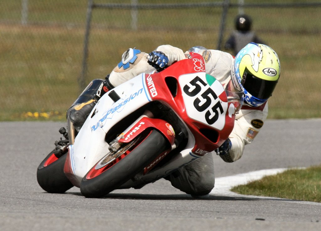
Who had the best looking MotoGp bike in 2007?
Who had the best graphic in 2007? Unfortunately teams with several small sponsors can not afford to have a simpler and more elegant painting scheme, so I wouldn't be surprised to see, as usual, the big teams leading the contest.
Subscribe to:
Post Comments (Atom)


4 comments:
Monster Energy has to come up with some good graphic since the green tea-m bike seems that has not left a great image in people's mind
Personally on the Kawa I would use more black and less green ....
Come on guys!!! Vote on the Fiat Yamaha colors!!!! Or you guys don't like the little Fiat???
FIAT YAMAHA!!!!!!
Post a Comment