
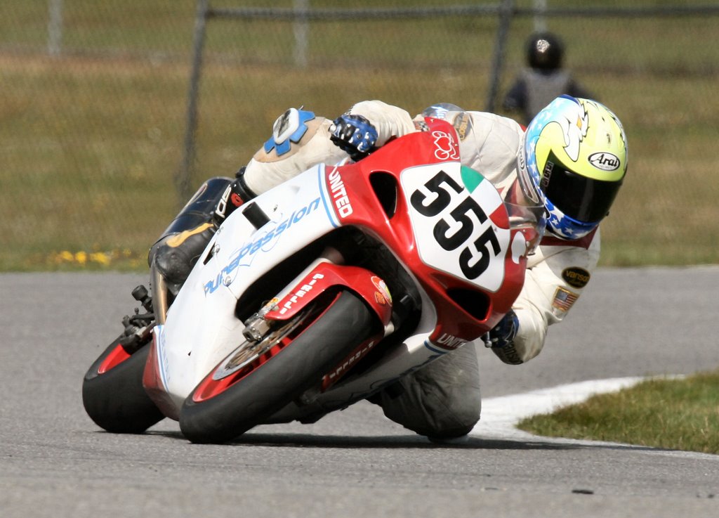
When a couple of weeks ago we went to pick up our new plastics painted by Mario Pires at AJS Autowerks Body shop we were very excited but back in Brooklyn a few guys raised their eyebrows when looking at the flamboyant rainbow flakes of a wonderful paintjob that, to them, it seemed more appropriated on a chromed-up low ride than a race bike. Personally, I was convinced that we had a good combination of colors with a very effective design so we had only to balance those glittery flakes with some original and precious decals.
With our luggage of thoughts and the first of the 5 bikes, Antonio, Naim and I went to see our friend Diana Sliwa. Along with her parents she owns JS Typography, a very successful graphic studio, located at 8659 18th Ave, Brooklyn, NY 11214 (718 676-6098 or 718 234-6847).
In the late 90s we were going for bike numbers and decals to another local shop but it was like to go to see a dentist with a terrible toothache: we had to do it, it was going to be expensive and we knew that we were going to satisfy our needs but not our emotions. Let’s be honest … our first few race plastics were just ok, nothing wrong with them, but overall blah, like a dish with no salt! Then, one day, I guess five or six years ago, Robert Lombardi met this young girl, Diana. At that time she was studying fashion design and helping her father in the new typography business. She had probably never seen a race motorcycle in her life, neither her father, but she decided to produce decals for who became her first road racer customer. In the following months her enthusiasm, immense creativity and patience in understanding each client’s need, made the rest: all the motorcycle riders in the neighbor started rely on her expertise to repair, personalize and improve the overall look of their bikes.
In this project we knew only: that we were going to use the PMP and PurePassion logos (trademarks designed by me and developed by Diana a couple of years ago) and that per Mario’s suggestion we should have tried orange pin stripes. We had no clue about what colors and font to use for the numbers, sponsors, and various logos … and how to “manage those flakes” ….
In similar situations Diana is the best: she has a proven method to collect, screen and organize the customer’s ideas to satisfy his or her mode of expression while guiding emotions towards feasible solutions that always remain tasteful.
It took several hours, more than a few espresso macchiati and several attempts to come up with the right combinations of colors to dress up Naim’s bike. We started with the pin stripes, then the numbers, next the Pure Passion decals. For those, as for the front fender PMP logo Diana did a really great job, something that I could compare to a piece of bijouterie: layers of special reflective material that was finally able to counteract the relentless game of rainbows created by Mario Pires’s flakes. At that point it was like to go downhill with the rest of decals ….. the motorcycle ying yang, Lombardi School’s logo, various personal designs, sponsors decals and so forth.
Diana is a multi talent woman. You could never guess what she is doing when you enter her store: printing or painting tee shirts, drawing mysterious women, air brushing helmets or creating sign for her customers.


So, the next time you have a graphic design project, do not forget … those “decals” in Brooklyn.


No comments:
Post a Comment